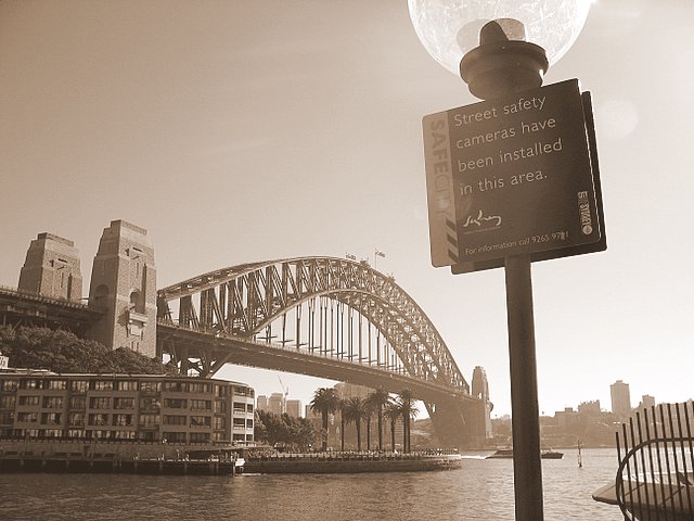
 I sharpened this and then had a play with the sepia colouring. It was a perfectly good photo in the first place apart from the writing on the sign that was difficult to read. But it look kind of olde world with the sepia.
posted by Shirley @ 1:29 AM
![]()

1 Comments:
hmm , just like the original prints .. except of course for the sign!
Post a Comment
<< Home